Common HTML/SCSS Markup Pitfalls
Incorrect HTML syntax or hierarchy
Section titled “Incorrect HTML syntax or hierarchy”Always respect proper HTML structure. Misusing tags, skipping levels (e.g., <h1> followed directly by <h4>), or nesting elements incorrectly creates accessibility and maintainability issues.
Not breaking components into sub-components
Section titled “Not breaking components into sub-components”In SCSS and markup, larger components often contain smaller reusable parts. For example, a c--card-a might include a c--btn-a or a c--hl-a (horizontal list variant A). When these sub-components exist, they should be separated for clarity and reuse, especially when design details already belong to a global module.
Layering issues: z-index and naming conventions
Section titled “Layering issues: z-index and naming conventions”Two common mistakes happen when handling layered elements:
- Negative z-index values → These often cause unpredictable layering and accessibility issues (e.g., elements becoming unreachable or hidden behind the background). Instead, manage stacking contexts with consistent positive layers and follow the project’s z-index scale.
- Inconsistent naming → When a component has multiple layers (foreground and background), always use clear and consistent naming:
c--component-x__ft-itemsfor foreground itemsc--component-x__bg-itemsfor background items
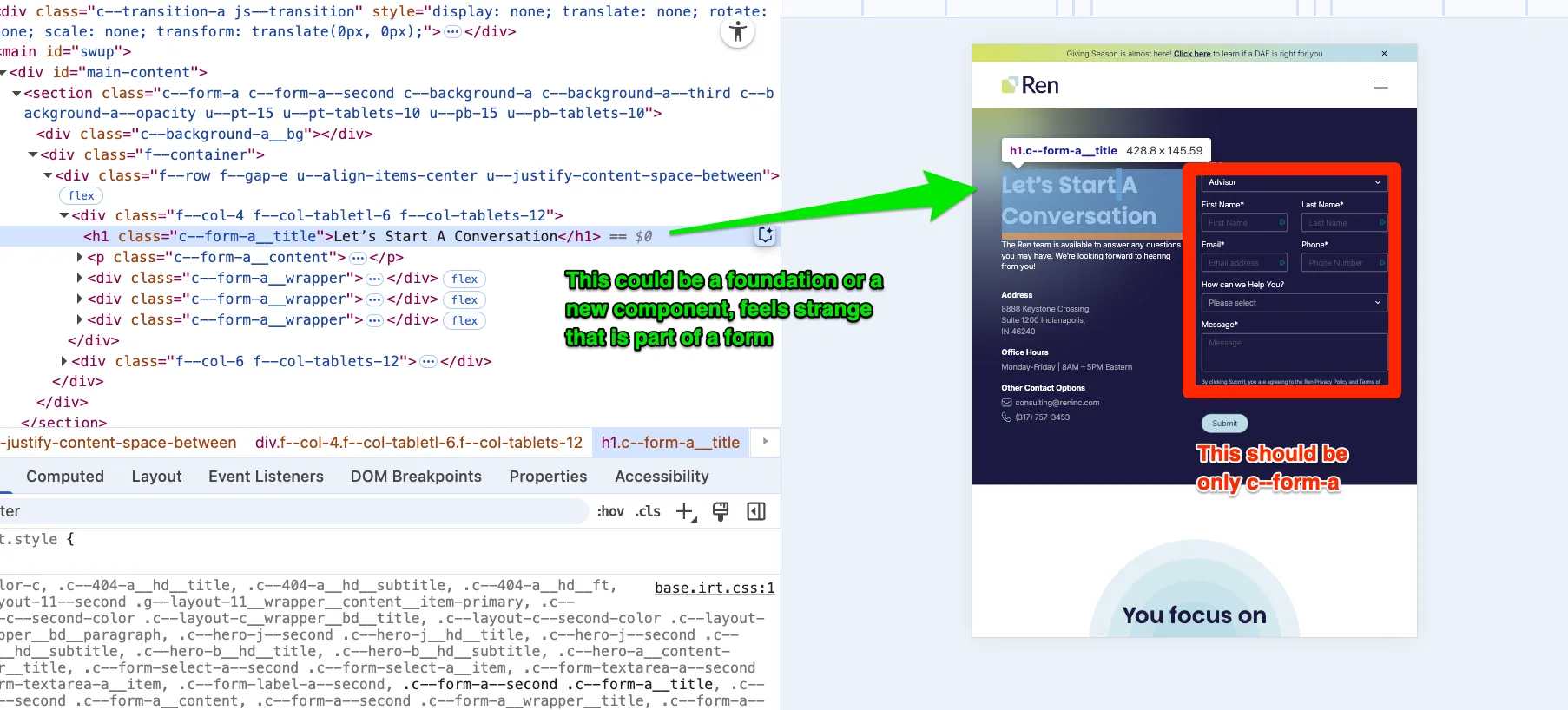
Overloaded components instead of splitting them
Section titled “Overloaded components instead of splitting them”Sometimes an entire sidebar or a large UI section gets built into a single “X” component. In these cases, the better approach is to split it into isolated foundation components and compose them, rather than packing everything into one large block.
Confusing Transition / Preloader / Spinner
Section titled “Confusing Transition / Preloader / Spinner”These are three separate sibling components—they are not nested inside each other. Each one has its own role, and they may be combined together when needed, but they should always remain as sibling <div> elements:
- Transition → front-layer wrapper during content changes
- Spinner → progress indicator (often displayed alongside a transition)
- Preloader → initial loading state, which may or may not include a spinner
Keeping them as siblings (not one inside the other) ensures clarity, consistency, and easier reuse across projects.
Background image syntax inconsistency
Section titled “Background image syntax inconsistency”Background images—whether SVG, PNG, or WebP—should always follow the same convention in WP vite Projects
background-image: url('#{$base-path}/assets/icon/scroll.webp');Hardcoding pixel values instead of using measures
Section titled “Hardcoding pixel values instead of using measures”In Figma, you may see spacing values like 40px, 56px, 16px, or 18px. These should always map to design tokens ($measure) and follow multiples of 8. For example:
margin-bottom: $measure * 4;Never use margin-bottom: 18px;. If a value doesn’t align to the 8px grid, confirm with design whether it’s intentional.
This doesn’t mean such values are always a mistake, but spacing should normally match one of the following:
- a $measure multiple
- a relative percentage (e.g., 25%, 50%, 100%)
- a specific value with a clear comment explaining why (e.g., a design exception)
Alwways transform components
Section titled “Alwways transform components”When positioning custom components, prefer transform: translate() instead of properties like bottom or left.
Using transform provides smoother GPU-accelerated animations, avoids triggering unnecessary reflows, and keeps layout calculations more stable.
For example, instead of:
.c--component { left: 50px; bottom: 20px;}Use:
.c--component { transform: translate(50px, 20px);}This approach ensures better performance and consistency across browsers.
Naming convetion on svg components
Section titled “Naming convetion on svg components”When working with SCSS, it’s easy to write selectors like this:
.c--selector-a{ color:red; svg{ padding:10px path{ fill:red; } }}However, this approach does not follow our coding conventions. An SVG is still a selectable element, and it should respect our component naming system.
A more consistent approach is to introduce a sub-element (e.g., &__artwork) and style the SVG through
.c--selector-a{ color:red; &__artwork{ padding:10px; path{ fill:red; } }}This way, we maintain proper naming conventions and keep styling consistent with the rest of the system.